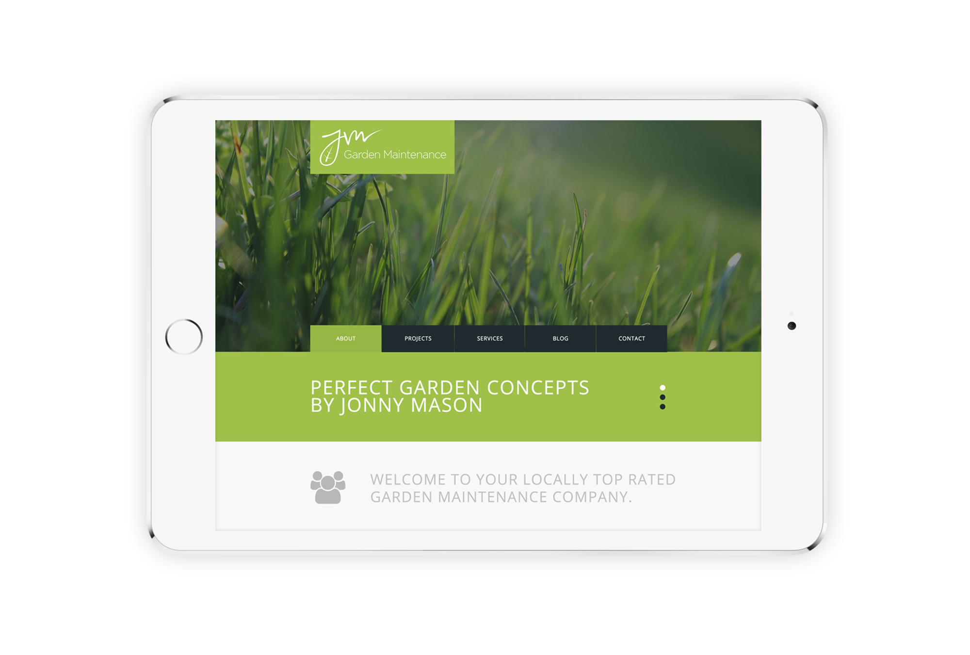
I was approached by company owner, Jonny Mason, who wanted to a logo which would would portray professionalism but allows for growth in the future. The challenge of this project was that Jonny wanted the ability to give the impression of an organisation while still retaining the personal service he currently offers customers. The final design actually uses Jonny’s handwritten ‘JM’ and I added the leaf symbol in the ‘J’ in order to add the element of the personal service while still remaining professional.


